Introduction
Your library website is the digital branch for your library resources and information. Collecting statistics and analyzing the effectiveness of your digital presence requires some specialized tools. If you are wondering how to start a website audit project, we've outlined our favorite methods and tools for evaluating accessibility compliance, content impact, site performance, and long-term metrics.

Part One: Accessibility Evaluation
Suggested Tool:
WAVE Evaluation Tool (free Chrome extension)
Does my site meet current accessibility standards?
WAVE is a web accessibility evaluation tool developed by WebAIM.org. It provides visual, easy-to-read feedback about the accessibility of your web content by injecting icons and indicators directly into your page. All analysis is done entirely within the Chrome browser.
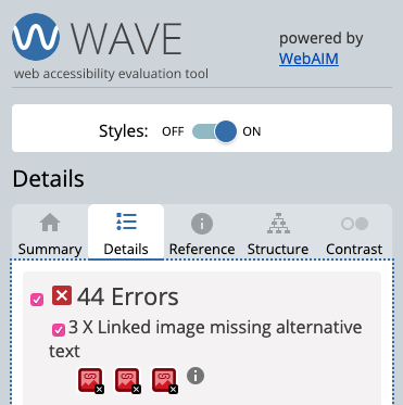
To run a WAVE report, simply click on the WAVE icon to the right of your browser address bar, or select “WAVE this page” from the context menu. In order to declutter the interface and get to the actionable items easier, navigate directly to the DETAILS tab and uncheck Features, Structural Elements, and ARIA. This allows you to see only the items that might need to be addressed, in order of importance: Errors, Contrast Errors, and Alerts.
As you navigate through your site, you will see the Errors, Contrast Errors, and Alerts highlighted on the page with icons. You can click on each of these issues within the Details tab or inline on the page to reveal more about the specific issue highlighted.
Deciphering these issues can sometimes be complicated and would easily be the subject of an entire article. So, for today’s purposes, we will only examine one issue in detail. We’ll visit a website that has a few compliance issues and turn WAVE on. We immediately see our Summary tab fill with information and by clicking over to the Details tab we can see a detailed list of any items that need to be addressed. As mentioned previously, we will uncheck Features, Structural Elements, and ARIA to declutter our visual guide to the right. If we investigate the first Error presented to us, we see this:
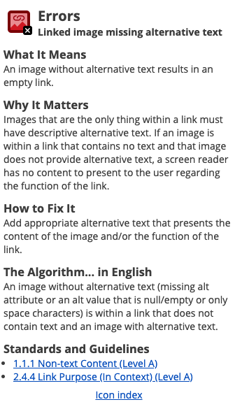
Clicking the Information icon next to these three errors reveals more information about this specific error:
Clicking the first icon highlights error on the page. From here, we can simply right click on the image in question and click Inspect to reveal the code surrounding this image:
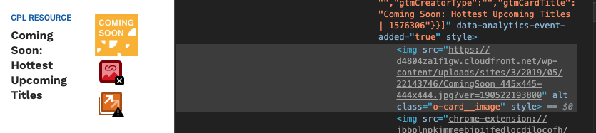
Let’s look at this code in detail. We have an HTML image tag with the source URL attribute, a blank ALT attribute and two additional CSS (styling) attributes. (Learn More about IMG tags)
<img src="URL-HERE" alt="" class="o-card__image" style="">
We can see that the ALT tag has been left blank. Looking back at the reference for this error, we can see that “images that are the only thing within a link must have descriptive alternative text. If an image is within a link that contains no text and that image does not provide alternative text, a screen reader has no content to present to the user regarding the function of the link”. Luckily, this is a relatively simple fix. Assuming your CMS has a way to define these ALT tags, you can log into your site’s administration and add an ALT tag to this image. The resulting code should look like this:
<img alt=“Coming Soon Hottest Upcoming Titles” class="o-card__image" src="URL-HERE">
With this fix in place, we simply need to continue exploring and fixing the errors presented to us by WAVE. Once you feel like you have addressed all the pertinent issues, you can run another scan to verify. If you are working with a team member or agency to fix these errors, you can share the URL for this Chrome Extension with them so that they are on the same page with you as you are attempting to resolve outstanding issues.
Please note:
WAVE presents all issues found using their bot, however, it takes some human review to determine if issues actually need to be addressed, weigh possible solutions against each other, and evaluate if an issue is simply a technical issue versus an actual barrier to accessibility. Keep the following in mind when analyzing the results:
- Not all issues are addressable due to the limitations of the CMS (content management system).
- Some issues are technical in nature but do not actually affect the user’s ability to navigate the site.
- If your library uses a CMS (WordPress, Drupal, etc.), some issues will be reflected on every page if they occur within the “shell” or “theme” of the website. If you have any issues or errors in your site’s theme this might be cause for concern while evaluating, however, remember the good news is that fixing these errors in one place will fix them on all pages.
Part Two: Content Assessment
Suggested Tools:
Google Analytics (free website with optional paid features)
HotJar (free website with optional paid features)
Setting Up Google Analytics & Collecting Data
From time to time it is a good idea to check your site’s analytics to see how your website is being used. This is a very useful tool in evaluating your content. You can see which pages are popular, how visitors are getting to content, if they are scanning or reading your content, and many other metrics.
There are two different ways to view your content analytics: the default “All Web Site Data” (unfiltered) or through a custom, filtered view that you have configured to only show data for specific content (for example, “Calendar Only”).
For this section, we will focus on the data from a filtered view of one section of a website, so that we can focus on the analysis of a section of content at a time. For this example, we will specifically be looking at the Calendar of Events; however, most of the instructions used within this section can also be used to evaluate other types of content or your site at large, without a filter.
For more information about the default view of “All Web Site Data” see the Site Metrics section below.
Setting Up Your Custom View
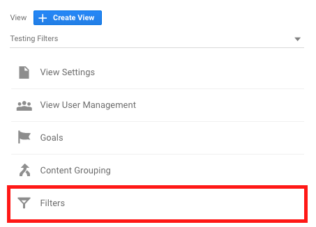
Let’s get started by setting up our new filtered view. Head over to your Google Analytics dashboard, select your library website’s account, and then scroll to the bottom of the left-hand menu and click on Admin. You will be presented with the management panels for your website’s Account, Property, and View. In the View panel, click the blue “Create View” button.
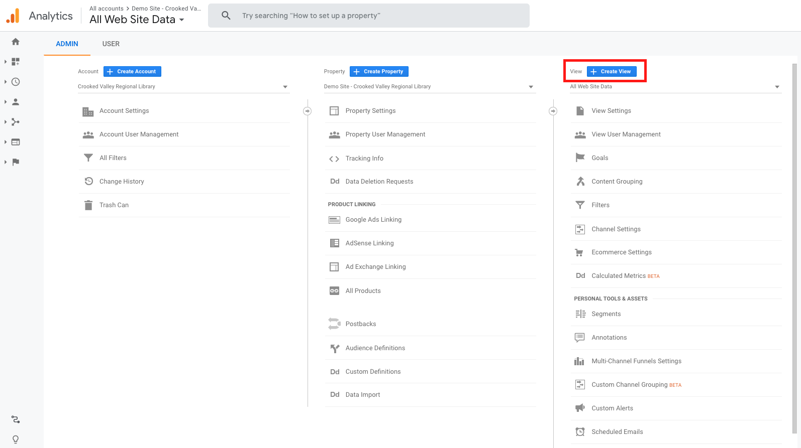
You can now enter the title of the view. For example, you could call this view “Calendar of Events.” You will then need to select your timezone and click Create View. You will be sent back to the Admin for your account, with your newly created view now selected in the View panel. In this panel, select the “Filters” option.
On the next screen click the red “Add Filter” button at the top of the page. This will open the Add Filter to View page. Now, we will define the custom filters to apply to this new View. There are countless ways to filter a view, however, for this example, we will focus on one specific filter: Request URI.
You will need to enter a filter name (for example, “Calendar”), select Custom Filter Type, Include, and as the Filter Field select Relative URI. For the Filter Pattern enter something that is unique about the URLs used in your calendar. For LibraryCalendar, every page that is within the calendar starts with your domain name, then “/events/“, then the permalink for the page you are viewing. So, to filter our view to only show data for the calendar, we will enter “/events/“ as our Filter Pattern. Finally, click the blue “Save” button at the bottom of the screen.
That’s it! You can now let this filter run for as little as two weeks and then come back to check the data collection within your new view.
Analyzing Your Filtered Google Analytics Data
To learn more about how your content is being utilized, we will focus on visitor behavior for this analysis.
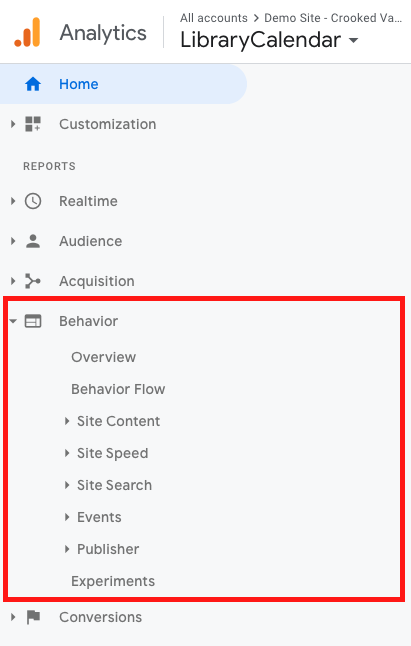
With your new view selected, navigate to your Google Analytics dashboard and toggle the Behavior report. This will expose the different reports you can run within Behavior, which focuses on content performance. These include Behavior Overview, Behavior Flow, Site Content, Site Speed, Site Search, Events, Publisher, and Experiments.
We’ll start with the Overview. This view gives you an overview of just a few of the key metrics available to you within Google Analytics. This is a good report to check from time to time to make sure you are on a positive trend. If any of these numbers decrease month over month or year over year, you will want to dig further into the data to identify any downward trends. Very often there is an expected reason for some downward trends, such as seasonal content like Summer Reading events, but it is good to stay on top of these trends and watch for any outliers.
The key metrics exposed here are Pageviews, Unique Pageviews, Avg. Time on Page, Bounce Rate, and Exit Rate (% Exit). Here are some definitions for these terms:
- A Pageview is defined as a view of a page on your site that is being tracked by the Analytics tracking code. If a user clicks reload after reaching the page, this is counted as an additional pageview. If a user navigates to a different page and then returns to the original page, a second pageview is recorded as well.
- A Unique Pageview aggregates pageviews that are generated by the same user during the same session. A unique pageview represents the number of sessions during which that page was viewed one or more times.
- Average Time on Page is simply the average amount of time all users spend on a single page.
- A Bounce is a single-page session on your site. In Analytics, a bounce is calculated specifically as a session that triggers only a single request to Analytics, such as when a user opens a single page on your site and then exits without triggering any other requests during that session. Bounce Rate is single-page sessions divided by all sessions or the percentage of all sessions on your site in which users viewed only a single page and triggered only a single request to Analytics.
- Exit Rate is the percentage of all pageviews that were the last in the user’s session.
From here, you can start reviewing other reports in this section. They are as follows:
- Behavior Flow allows you to see the path visitors most commonly take on your website. This includes the first page they look at to the last page they visited before leaving the site. It is a visual report that let’s you see how long visitors stay on your site and where they decide to exit.
- Site Content is a section of additional reports: All Pages, Content Drilldown, Landing Pages, and Exit Pages.
- All Pages is a report that displays the top pages on your website based on traffic.
- Content Drilldown is a report that is helpful for looking at your site’s traffic in sections. This is only useful if your site is clear divided into sub-folders, such as /blog, /support, /events, etc.
- Landing Pages lets you see the top pages visitors use to enter your site.
- Exit Pages is essentially the opposite of the Landing Pages report, allowing you to see where your visitors leave the site.
- Site Speed is a section of reports used to assess your site’s speed. We will review these reports further in the Performance section of this article.
- Events allows you to track specific interactions on your website, such as clicks on external links, file downloads, and video plays.
- AdSense only applies to sites using Google’s AdSense advertising platform.
- Experiments is used to track experiments you are currently conducting, such as A/B split testing landing pages, conversion goals, etc.
In addition to these reports, since you are viewing filtered data that only applies to your Calendar of Events, you can also explore the Audience and Acquisition reports to learn more about your visitors, such as where they are from, what browser or operating system they are using, if they used search engines or social media to find your calendar of events, and much, much more. For a rundown of what these reports are, see the Site Metrics section.
Additional Google Analytics resources:
Google Analytics Campaign URL Builder
Google Analytics Official YouTube Channel
Using HotJar to Measure Visitor Experience
Hotjar is an analytics and feedback tool that reveals the online behavior and voice of your users. By combining both analysis and feedback tools, they assist you in seeing the “big picture” of how your site’s visitors are using your site and gives you tools to improve their user experience.
On the analysis side, HotJar offers the following:
- Heatmaps - a visual representation of clicks, taps and scrolling behavior – which are the strongest indicators of visitor motivation and desire.
- Visitor Recordings - see playbacks of clicks, taps and mouse movements so that you can identify usability issues on the fly and the issues that are encountered.
- Conversion Funnels - funnels are used to determine both which page and at which step most visitors are leaving your site before completing a specific call to action.
- Form Analysis - evaluate online forms to see which fields are taking too long to complete, which fields are left blank, and why your visitors decide to abandon a form before submitting.
On the feedback side, they offer the following:
- Feeback Polls - target a subset of users and show them a small poll in a dismissable modal at the bottom of the screen.
- Incoming Feedback - identify visual elements on your site you would like to have users provide feedback about.
- Surveys - collect responses to short surveys in real-time from users on any devices via web links, emails, or even a popup just before they leave your site.
For the purposes of auditing content, we will focus on two of the features provided by HotJar: heatmaps and visitor recordings.
First, the installation process must be completed. Simply create a free account and HotJar's on-screen prompts will guide you through the installation of their tracking code. The process is almost identical to Google Analytics: create a tracking code, edit your site’s theme, insert the tracking code, and verify the tracking code is working.
Once you are set up and data tracking is successful you will want to set up at least one heatmap and one recording.
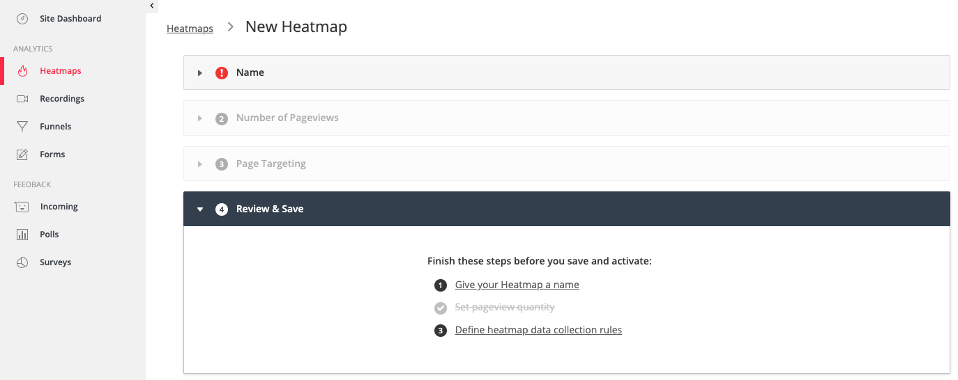
In order to create your first heatmap simply click Heatmaps on the side menu and provide the required details, such as name, number of pageviews, and page targeting. You can specify as little or as much detail as you would like to. Typically we start out with a heatmap of only the homepage. This is a good way to both get familiar with the interface while also collecting useful data about how people are engaging with your home page. You will be able to see how far people are scrolling down, where they are clicking, and where they hover with their mouse (can indicate where they expect to be able to click something or could simply mean they are reading). You’ll want to let this run for a minimum of two weeks and ideally a full month to get a data set that is representative of your user base.
In much the same way, you can now set up your first 100 free recordings. Again, you can specify as many or as few parameters as you would like. After defining your parameters, click Start Recording to get started.
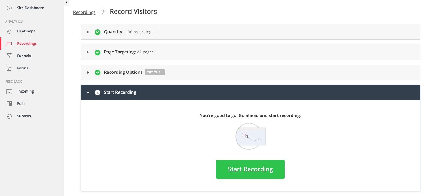
As visitors come to your site, HotJar will track their movement, clicks, and scrolls. Again, this information is all scrubbed of personal data. You will be able to see a “playback” of their actions, which can be very informative. For example, you can see if a large portion of your visitors is attempting to click in an area that is not clickable. It is very easy to see when users become confused or frustrated while attempting to find content on your site. These issues can then be addressed, start a new recording, and compare the results. This all happens in real-time, so there is no need to wait a month to review your data. HotJar will email you when your 100 recordings have been used up so that you can log in and review your findings.
Of course, the other tools they provide are very useful, however, not every tool is useful for everyone. We would suggest you try out the features that are available within your free account and see what works best for you and your audience.
Additional HotJar Resources:
Would you like to see a demo of LibraryWebsite?
Part Three: Site Performance
Suggested Tools:
Google PageSpeed Insights (free website)
How do I gauge my site’s performance?
A key ingredient in maintaining a good website, no matter the audience, is performance. In the past, these metrics were monitored by individuals who were vigilant about site performance and used to improve their site on a case-by-case basis, however, these metrics are now used by some hosting providers to determine billing and search engines have now taken an interest. Google factors site performance into the overall score for your site within their search rankings.
Previously, we have gone into some detail about using both Google Analytics and HotJar, so for this section, we will focus on Google PageSpeed Insights, Google’s free tool for assessing your site’s performance using the key metrics that they are tracking.
Google PageSpeed Insights, when compared to other tools we have outlined, is the most technical. The average person will not know many of the terms used within the reports generated. It will take some research to fully understand the reports and then take action based on those.
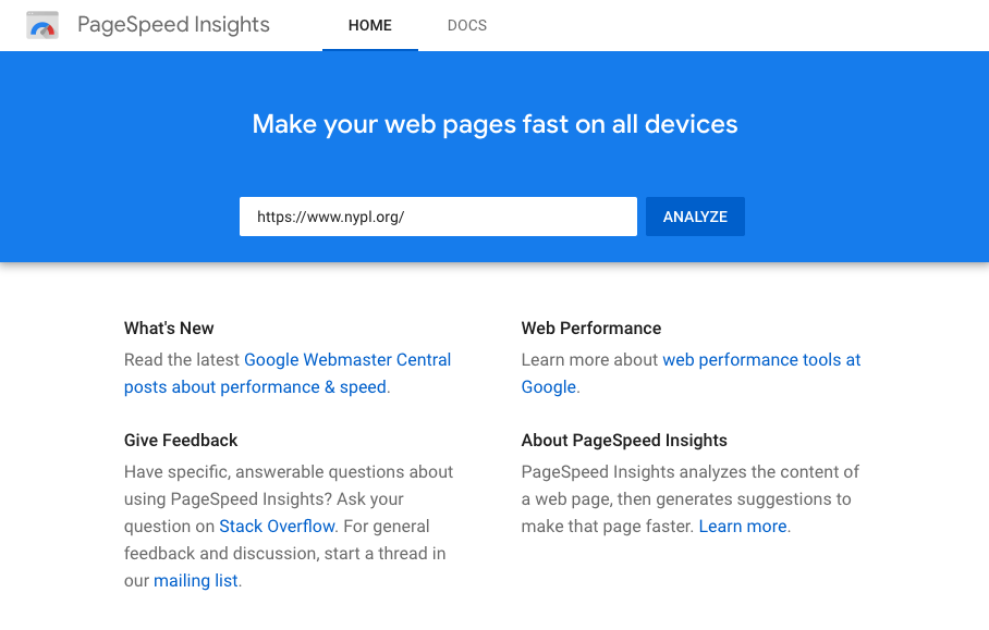
When you visit you are prompted to enter your URL and click Analyze.
Once your analysis is complete you will be presented with a report for both Mobile and Desktop. Here’s what they might look like for each:
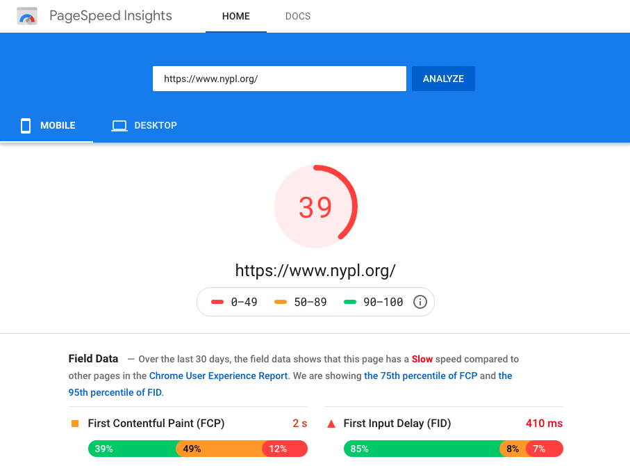
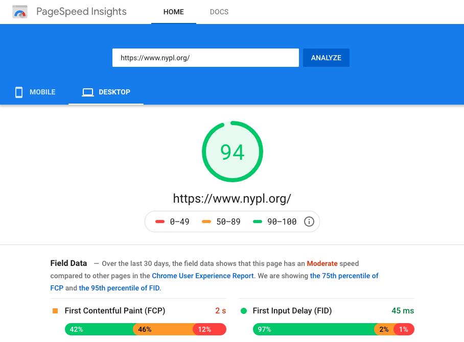
You will be given an overall score with additional details below in the Lab Data. Again, this report is very technical. Here are what a few of the terms within this report mean:
- First Contentful Paint (FCP) - a metric for measuring perceived load speed because it marks the first point in the page load timeline where the user can see anything on the screen—a fast FCP helps reassure the user that something is happening. Learn more here.
- First Input Delay (FID) - a metric for measuring load responsiveness because it quantifies the experience users feel when trying to interact with unresponsive pages—a low FID helps ensure that the page is usable. Learn more here
- Largest Contentful Paint (LCP) - a metric for measuring perceived load speed because it marks the point in the page load timeline when the page's main content has likely loaded—a fast LCP helps reassure the user that the page is useful. Learn more here
- Speed Index - a metric for measuring how quickly content is visually displayed during page load.
- First CPU Idle - a metric for measuring how long it takes a page to become minimally interactive.
- Time to Interactive - a metric for measuring how long it takes a page to become fully interactive.
- Max Potential First Input Delay - a metric for measuring the time from when a user first interacts with your site, such as clicking a button, to the time when the browser is actually able to respond to that interaction. Learn more here
Moving down the report you have two additional sections. Clicking on each item reveals specifics, such as a list of images that could be improved by compressing them or changing formats.
The first, Opportunities, outlines suggestions that can help your site load faster. These items don’t directly affect your score, however, they are suggestions based on current web standards.
This is followed by Diagnostics, which provides more information about the performance of your website. Again, this doesn’t affect your score directly, however, it will increase your performance.
Part Four: Key Metrics to Measure Over Time
Suggested Tool:
Site Audit vs Long-term Monitoring of Key Metrics
We have covered several different tools for performing a one-time site audit for the purposes of evaluating the following areas of your site: accessibility, content assessment, and site performance. Now, we will outline the key metrics that you will want to continue to monitor outside of the site audit. You can use these metrics to keep an eye on the heartbeat of your site: watch user trends rise and fall, be aware of any potential technical problems, and make better-informed decisions moving forward.
For this monitoring, we will use our reliable friend, Google Analytics. However, instead of actively running on-demand reports, we will set up automated, emailed reports that you can review on a schedule.
First, let’s review the key metrics again that we want to keep an eye on:
- Pageviews
- Unique Pageviews
- Session Duration
- New vs Returning Visitors
- Average Time on Page
- Bounce Rate
Now that we know what metrics we are looking for, let’s set up automated reports to keep an eye on them. Start by opening your Google Analytics dashboard and navigate to Audience Overview. At this point, you will want to decide how often you are going to run these reports. To start out, we would suggest reviewing them either once or twice a month. For this example, we will assume the reports will run once a month.
Clicking the date in the top right corner of your dashboard allows you to pick date ranges to apply to this report. For the Date Range, choose “Last Month” in the dropdown and then for Compare To choose “Previous Period”. The second dropdown is optional. If you simply want to look at the month’s data without a comparison to the previous month, you can uncheck the Compare To option.
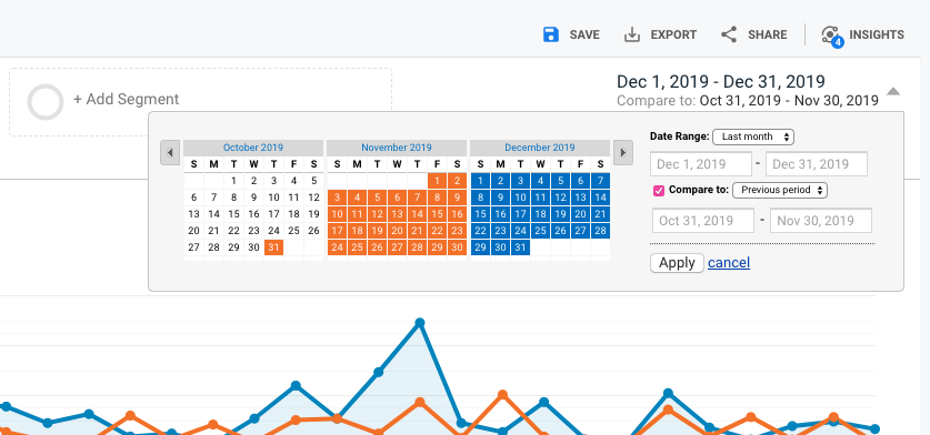
Click Apply to apply this date range for your report. You are now looking at your Audience Overview report with a dynamic date range selected. If you want to be able to run this report quickly in the future you can save this report by clicking the Save icon above the date range.
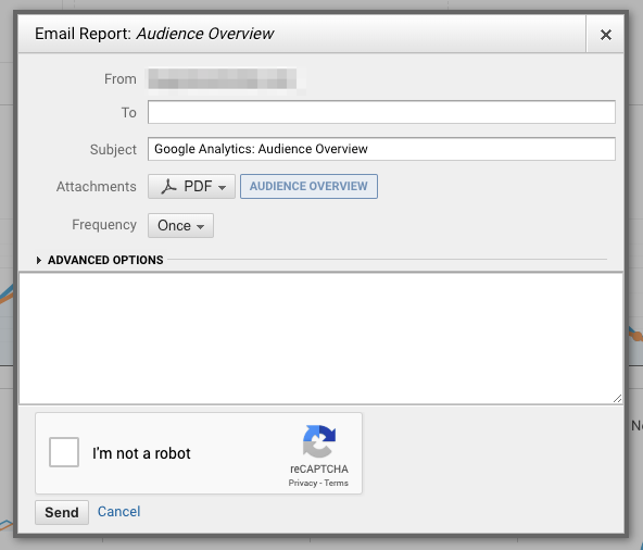
In addition, we are going to set up an automated report to send this report in PDF format to our inbox. To do this, click the Share icon just to the right of the Save icon. You will be prompted to enter a recipient email address, a subject has been pre-filled, and the PDF of this report is attached. Next, you can select a frequency to send this report via email. For this example, we will choose “Monthly on the 1st Day of the Month”. With these parameters selected, we will receive an email on the 1st of each month that includes a PDF report of the Audience Overview with the analytics data for “Last Month” as compared to the “Previous Month”.
With the date range already selected, you can now visit each report you wish to receive in this way and click the Share icon to receive each of them in this same way. If you want to receive a report for a different range, you can use the dynamic date selectors to choose a new date range and then click the Share icon.
You will find that this is a significant time-saver if you are anything like us. When we open Google Analytics we tend to really get lost in the data. As your reports hit your inbox, you can take just a few minutes to quickly scan each of these key metrics we covered in this article. And, if you happen to notice something that needs deeper investigation, you can always open Google Analytics and really dig into the data.
In Closing
Your site audit can include as many or few of these tools and tracking metrics as needed. We also recommend reaching out to any of your third-party digital services vendors to find out what kind of data they make available about your patrons' use of their platforms to develop a well-rounded picture of how effective your digital presence is.
If you have any questions about how Library Market can help you build a more effective web presence, please don't hesitate to contact us!