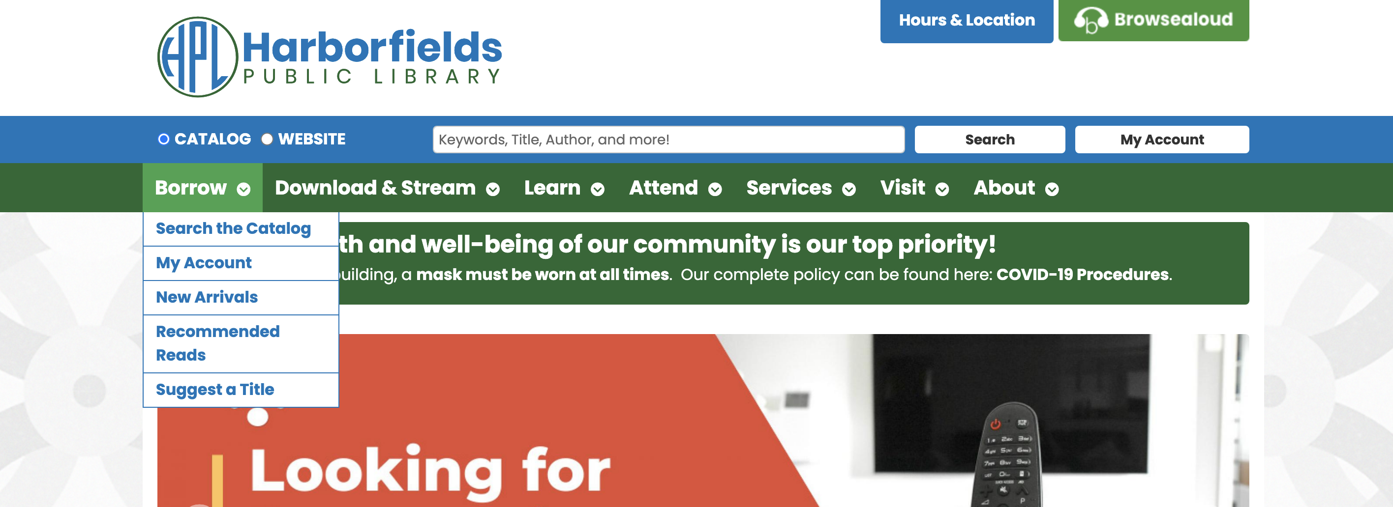
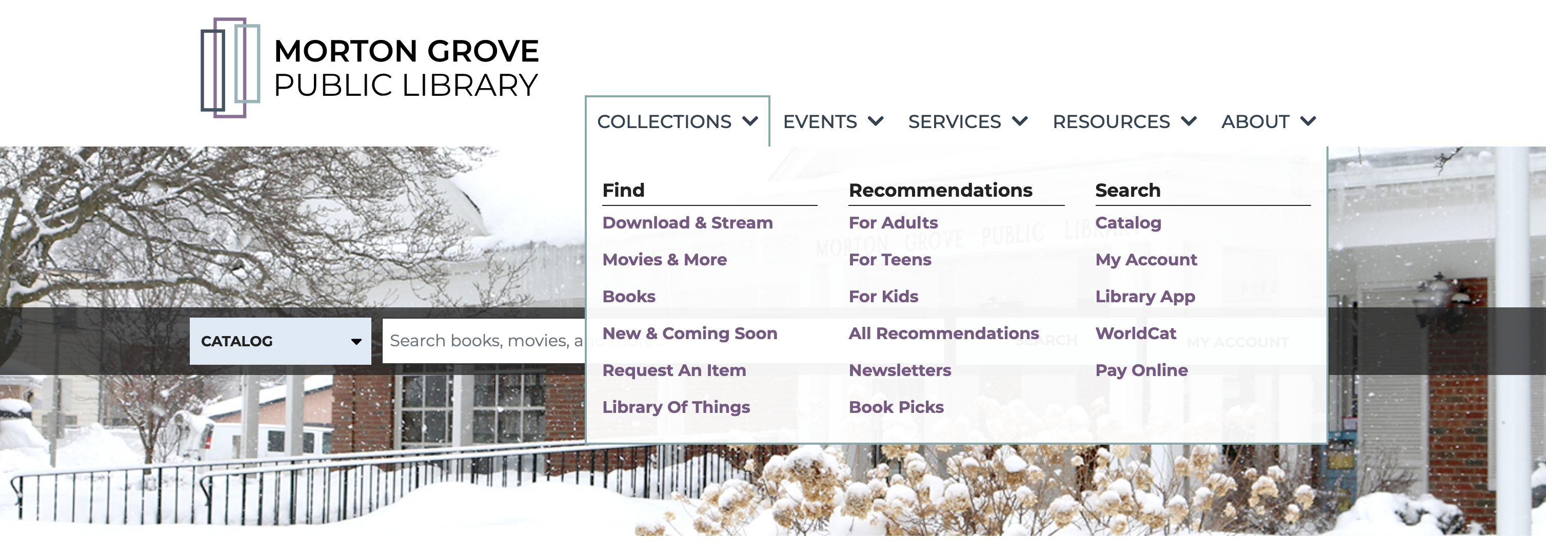
One of the first big decisions in a website project is choosing a menu style: traditional or mega. Traditional, or "simple," menus have primary menu categories with secondary menu items linked underneath. Mega menus have an extra level added so that there are primary and secondary labels and a tertiary level with links.

A sample outline for an “About” section in each style is below:
Mega Menu
- About
- Information
- Hours & Locations
- Contact Us
- Library Staff
- Board of Trustees
- Policies
- News & Updates
- Blog Posts
- Building Project
- Employment Opportunities
- Support the Library
- Friends of the Library
- Donations
- Volunteering
- Information
Traditional Menu
- About
- Hours & Locations
- Board of Trustees
- Policies
- Employment Opportunities
- Volunteering
- Library History
This post will walk you through the pros and cons of each menu style and offer insights into which menu style may work best for your library.
General Menu Strategies
Before we dive in, we want to address a few high-level questions about our strategy for menus in general:
Q: Should the menu show everything on our site?
A: No, you do not need to list every page on the site in your menu. A menu should present a clear set of options for navigation, not outline the entire site. In some cases, it's OK to lead a user through a sensible navigation path for specific content rather than presenting it in the menu. Examples of this might include an Obituary Search page and a High School Homework Help page; users can intuit that this information is linked from a main Local History and Genealogy page or a Teens page, respectively, without needing to see them in the menu.
Q: Can we have more than one menu?
A: You may have a couple of top-level functions in the site's structure (header and footer) that you opt to not repeat in the menu; examples include 1) an FAQ/help page linked from the header because it "belongs" to the whole site rather than a single section, and 2) listing common "About" links for contact information, hours & locations, policies, staff, board, and employment in the footer. But we generally encourage libraries to avoid additional menus with different sets of dropdown options otherwise. A single, consistent menu is much easier for users to navigate.
Q: Should categories in the menu also be clickable?
A: Let's say you have a primary menu category called "About" that you want to both open to a set of pages and be linked to an About Us page. Whether you can and should do this will depend on a couple of factors: 1) is your site set with dropdown menus that open on click or open on hover? If they open on click, it isn't technically possible to assign a path since a click is already reserved for opening the menu. 2) Is the behavior optimized for mobile users? Even if you use hover menus and can assign a link for a click, this behavior is generally only suitable for desktop users. Mobile devices don't have "hover" states—everything is done with a tap, so tapping "About" on a phone or tablet can't both open the dropdown menu and go to a new page. In general, we recommend only having links for the last level displayed (so tertiary on a mega menu and secondary on a traditional menu). In most cases, plan to have an "About" category with a link to "About Us" as the first item in the dropdown.
Q: Can we use "flyouts" in a simple dropdown menu for occasional tertiary items?
A: This seems like a logical approach when only a few items in a traditional menu need additional links. We don't recommend it, however. Users with reduced dexterity find it challenging to make and sustain the motions used in operating flyout menus on desktop computers, making flyouts a less accessible choice.
Menu Structures
When creating your menu structure, consider your site's current content load and potential future content priorities and try to strike a balance across categories you can support now and in the future.
Content Load
Even before building a site map, you'll want to appraise your existing site’s content and consider new content to be added. If you have a relatively light amount of content, simple menus may be the best fit. If you have a lot of content, choosing a mega menu structure may be the best course of action. If you're unsure if your content load is substantial enough to go the mega menu route, construct a basic site map for each menu type and see which one better presents the content.
Priority Level
After making a list of all the content you want, prioritize each piece. The system we use at Library Market includes assigning the following levels:
- Priority 1: on the homepage and in menu/structure
- Priority 2: maybe on the homepage, definitely in the menu
- Priority 3: in the menu, frequently used content
- Priority 4: maybe in the menu, used content
- Priority 5: linked from other pages, infrequently used content
- Priority 6: no longer needed (or will add later)
Next, identify your landing pages. These are high-traffic pages that contain multiple links to other areas of the site (either under that page specifically or just related from another section). Branch pages, kids/teens/adults pages, local history/genealogy pages, and about pages are typical examples of landing pages.
How many Priority 1-3 landing pages do you envision? Most main menus can comfortably fit a list of 4-7 items. If your menu has more than this, a traditional menu may limit your menu presentation options and require additional clicks to get to important content. Mega menus are equipped for a higher specificity level because they include primary, secondary, and tertiary levels that prioritize content.
Content Balance
If you're leaning in the direction of a mega menu implementation, clarity and consistency are key. The goal is to organize the content so users can find what they need quickly while balancing the content relatively evenly across each category. Ask yourself, "Can I get to almost everything within 2-3 clicks? If anything requires more clicks, can we create an intuitive path to it?" If the answers are no, you may want to revise your menu.
Balance and consistency within the menu tiers are a significant part of successfully using mega menus. Do your best to keep a relatively even number of secondary items nested under one primary one (2-4). Also, keep a relatively even number of tertiary items nested under a secondary menu (3-7). This ensures that you can use consistent styling in all of your menu sections and that the menu feels balanced. You may need to revise your site map several times to find ways to break your content into categories clearly. "Services," in particular, can be a nebulous but necessary category for library menus and is often the trickiest to organize.
When creating your menu and overall site map, don't forget that you want the site to grow with you. Identify content areas that are likely to see expansion soon and make sure to leave room for additional content. Mega menus are designed to offer greater precision in terms of content organization, but you run the risk of menu bloat if you tack on too many tertiary links.
If you plan to use a traditional menu, it's still important to have clear and balanced categories with room to grow. They just won't have a secondary level of organization as a mega menu does.
Choosing a Style
Traditional Menus
Reasons to choose a traditional dropdown menu include:
- The simplicity of the menu structure can positively impact user experience
- Better user experience on mobile because you don't have to "drill down" beyond the primary level
- Good fit for sites with fewer pages
- Your content breaks cleanly into top-level categories; subcategories would just introduce unnecessary complexity
- You prefer menus that take up less space when open and are simply styled
Mega Menus
Reasons to choose a mega menu include:
- More organization inside the menu areas
- Helps users make sense of content by breaking them into subcategories
- Great fit for sites with lots of high-priority content
- More room for growth overall (but also more room for bloat…)
- You may prefer menus that are more prominent when open
There’s no right or wrong choice between traditional and mega menus in general, but there are a number of factors to consider to determine which approach is right for your library. If you’d like to know more about our website work and what we can build for you, please reach out to us.